Zine Layout: Version One
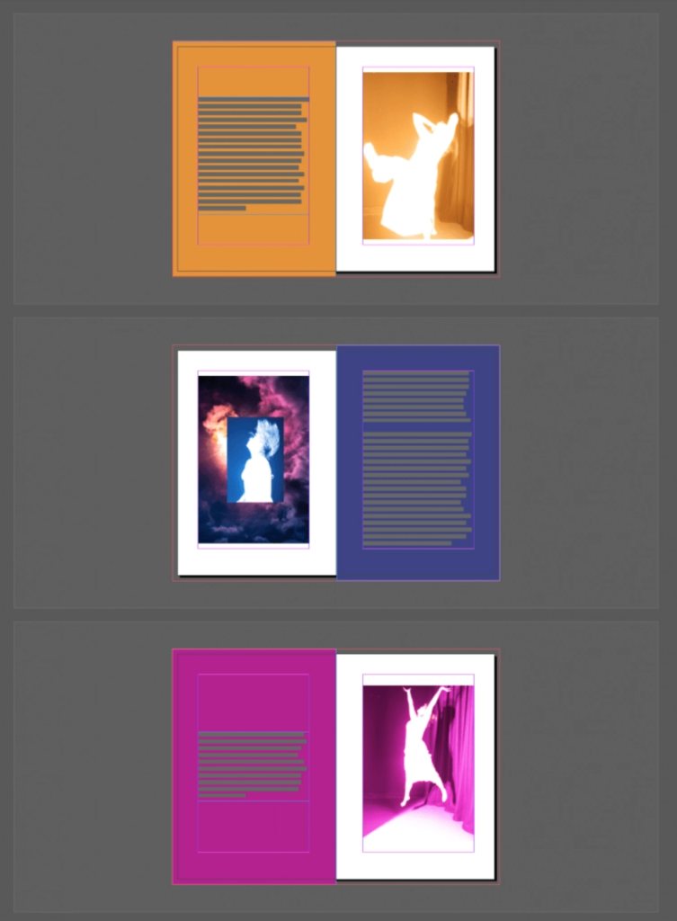
For the zine layout, I decided to separate my mother’s short story into multiple sections to spread out over six pages and then have an image that would correspond with the emotional tone of the writing and motif of that particular section.
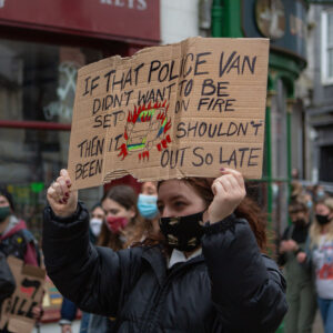
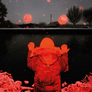
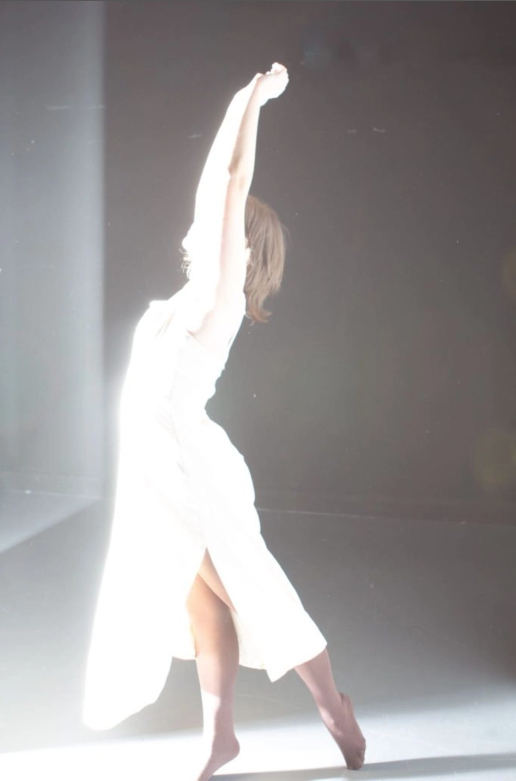
Initially, I knew what images worked best for three zine sections. Still, I decided to capture more specifically relevant photographs for the first, second, and third zine pages. I have captured images that were more conceptually optimistic than portraying the negative emotions introduced at the start of the short story.

Using the eyedropper tool, I selected the colour from the images and changed the colour of the shapes behind the short sections of writing as I wanted to have the pictures and photos have an equal visual weight so the viewer would be considerate of both pieces of work. I have spoken to reprographics about their requirements for printing zines and how they bind them as I would like a cost-efficient option. Still, I need to consider how the colour of the images and pages will come out once printed, as they will not be as bright as they appear on a screen.


