Edits: Graveyard Shoot with Jane Haze
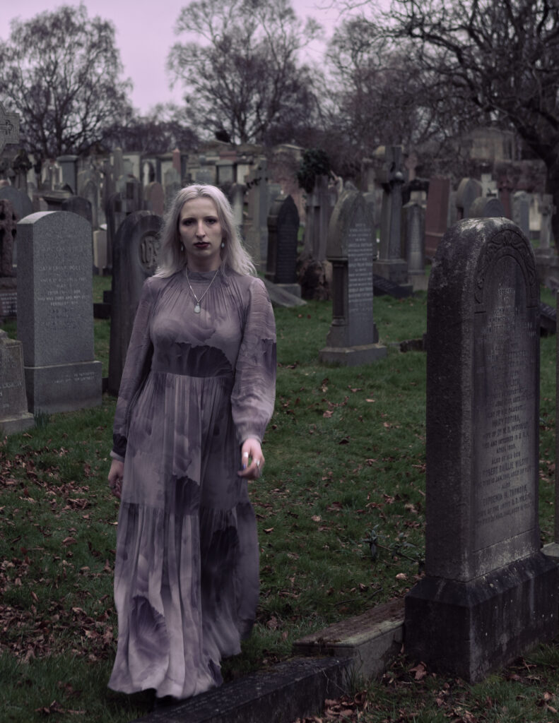
During the photoshoot, I made every effort to capture appropriate publicity images. Unfortunately, the photographs didn’t meet my expectations and I couldn’t find any that met the necessary criteria according to the initial interview and mood board we created together. Despite this, Jane Haze was pleased with one of the images I took and decided to use it as her new profile picture on social media. You can see this in the picture below:

To achieve this result, I had to edit the image. The original photo was overexposed, so I had to adjust the highlights and whites to create a more balanced image. This was made easier by the fact that I always shoot in RAW format. Additionally, I lowered the exposure slightly to recover some of the lost details.
One of the challenges I faced during the shoot was dealing with the model’s hair. It had been chemically damaged, which disrupted the soft, ethereal look that Jane was trying to achieve. To solve this problem, I used an adjustment brush to soften the hair by lowering its clarity.
Lastly, I made some adjustments to the colour scheme to fit with Jane’s online and personal branding. Specifically, I adjusted the shadow, mid-tone, and highlight hues to create a subtle dark lavender colour scheme. This way, the image would be consistent with Jane’s overall brand image.

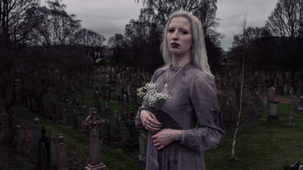
To create an even better image, I used a technique that I learned from a professional photographer. Instead of only copying and pasting the settings from the previous image, I adjusted them according to the characteristics of the new image. This required me to spend a bit more time, but the result was worth it as the image now has a unique look that is different from the previous one.
Aside from tweaking the settings, I’ve also implemented some choices to improve the visual appeal of the image. As an example, I noticed that the new image had a darker exposure due to different lighting conditions. To fix this, I chose to adjust the exposure and blacks. This approach effectively improved the image by bringing out more details and making it more attractive to the eyes.
I made the image more flexible by cropping it to be a cover photo on different social media platforms, such as Facebook. I considered the dimensions and aspect ratio of the original image and successfully created a composition that works for both versions. I applied the rule of thirds while cropping the image and placed Jane Haze towards the right side of the frame for two reasons. Firstly, to provide room for the profile picture. Secondly, to craft a captivating visual composition.
Despite the work and time Jane Haze and I put into the images, I have decided not to use them as part of my final selection. I feel that they are of much lower quality compared to the photos from the first photoshoot.


Leave a comment