Musician Poster for Jane Haze
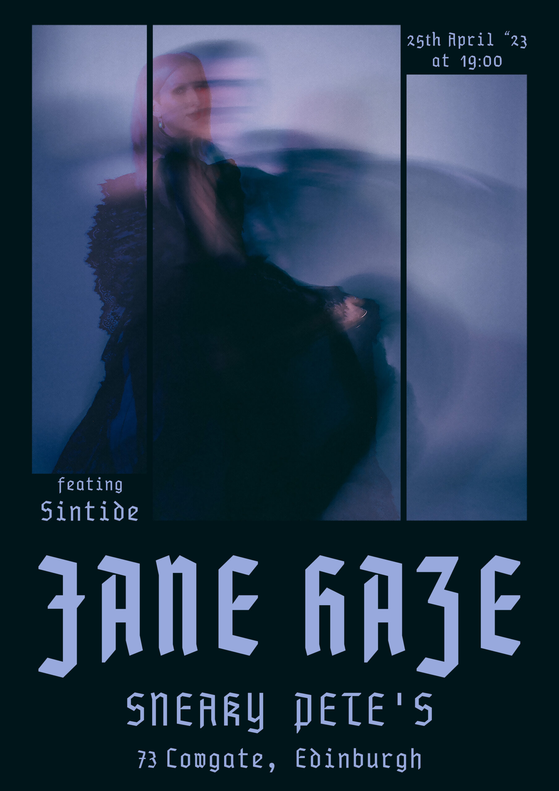
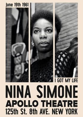
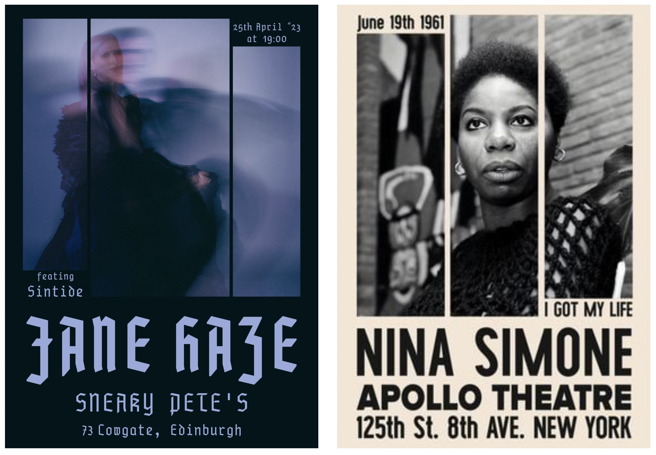
To create the poster, I was inspired by Robert LAN’s design on the right. I found it interesting that he left the upper third of the poster empty, allowing the image to breathe. This approach created a sense of balance between the image and the text.
When it came to selecting the background colour, I started by using the colour picker to select black from the model’s dress. Since I realized that using a true black might be too heavy for the soft nature of the image.
Next, I had to choose a font. During the initial brainstorming meeting with Jane Haze, we discussed different styles, particularly gothic styles, as inspiration for her publicity images and poster. I ultimately went with PragmataPro Fraktur, a gothic-style font. However, after adding the date and address, I realized that the numbers did not match my design. To address this, I used Eskapade Fraktur Regular for any numbers and raised the letter height and size to match PragmataPro Fraktur.
Lastly, I wanted to make sure that the poster would look good on any online platform. To achieve this, I used the colour picker to select the violet from the image background and adjusted it to web-safe options. This way, Jane Haze would be able to use the poster on any website or social media platform.
Leave a comment