Screen Printing Workshop: Day 1
Day One:
During the first day of the workshop, we worked on creating designs for our screens. To keep within the timeframe and make it easier to work in pairs (as we were sharing A1 screens between two people), we were allocated only four layers per person. I decided to work with four images that I would turn into four bitmaps.
I learned that a screenprint screen is made of a lightweight aluminium frame and mesh. The hole count per centimetre determines how much ink is allowed through onto the paper below. A lower thread count is best for flats, which are plain layers mostly used as a background, and a higher thread count is best for finer details like a bitmap of a photograph.
A bitmap is a digital image file made up of pixels. Each pixel contains information about its placement in the image. Bitmaps are commonly used for photographs and other complex images because they can capture a wide range of details, which are printed onto acetate.
We also learned about layering colours. If we want colour from different layers to mix like a risograph, we want to place lighter colours on top of darker colours, which can create a unique mix that is incredibly hard to achieve digitally. In terms of colour temperature, the top colour is the dominant temperature. We also learned about the knockout effect, where you layer a colour on top of another to completely cover a colour so it doesn’t mix. However, a knockout is extremely hard to achieve in screen printing and you will likely need to print twice in the same spot to knock out the colour below, which is hard to do with little experience and time. It is impossible to achieve a knockout effect with a bitmap, which changed my idea of creating a vivid monograph flat with a knockout white bitmap.
Taking all that information into consideration, we started to create our designs and used black ink or red-based paint that will block out the UV light when we expose our screens. When creating layers, we needed to always consider the density of the mark-making and to check the blacks of the marks against a Lightbox not against a flat surface. If you want to make greys visible, you can lower the exposure time of the Lightbox, but this doesn’t apply to bitmaps. If you want more contrast on a bitmap, you can increase the exposure time, but it won’t get rid of any visual information as the image is turned to black dots with no visible greys.
When exposing our screens, I needed to figure out what orientation I was printing in as I needed to consider how to blend two colours on one layer since you have to print in the same direction with every layer. Another thing I needed to consider was the moiré effect that can occur with photo bitmaps, which can be fixed by slightly rotating the bitmap by 10° on the UV unit.
As I was working with bitmaps, I didn’t have much to do while everyone else was finishing their mark-making. So, I went on to mix my colours for the next day. I was only allowed to mix three new colours, so I decided to go with magenta, purple, and orange. When mixing ink, you need to consider the translucency of your colours, which is dependent on your ratio of ink and medium. Since I wanted fully saturated vivid colours for my prints, I chose a 1:1 ratio, which later would create problems for me when printing, as the ink would dry much quicker and give me less working time to create my blends and monographs. To prevent this and give me more working time, I added a retarder to prevent the ink from drying out.
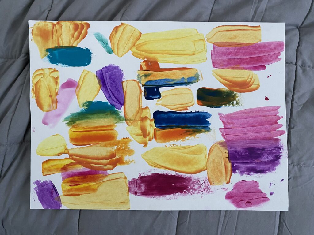
Below, I have a picture of my ink testing sheet where I experimented with creating the right colours:

To properly test your colours for an accurate colour, you have to scrape it with a spatula and wait 10 minutes until it dries, where the lightest part is the colour you will end up with when printing, as the mesh should only allow the smallest amount of ink to fall through.
For the magenta, I created it by using magenta ink and medium, as I wanted it to stay as bright and vivid as possible. However, for the purple and orange mixes, I had to do more experimenting. For the purple, I used the dioxazine purple available, but it was way too warm for my preference, so I added a tiny amount of ultramarine blue ink to cool it down so there would still be a nice contrast between the magenta and orange in terms of colour temperature. For the orange, I followed a colour chart I found online and mixed a benzimidazolone yellow and carmine red, but I made a mistake by starting with the red instead of the yellow, as the red tones were too prominent, so I had to mix it down with more benzimidazolone yellow and medium to correct it.
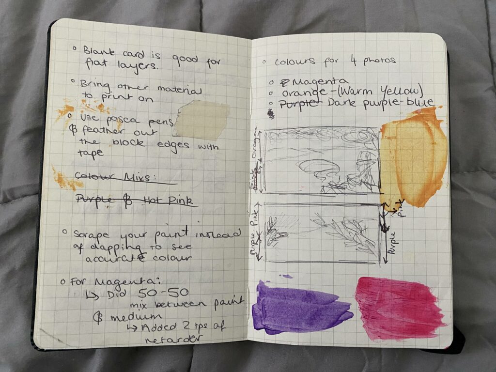
After achieving my colours, I sketched a basic plan of how I would use two of these colours to create a gradient while printing, which is shown below:

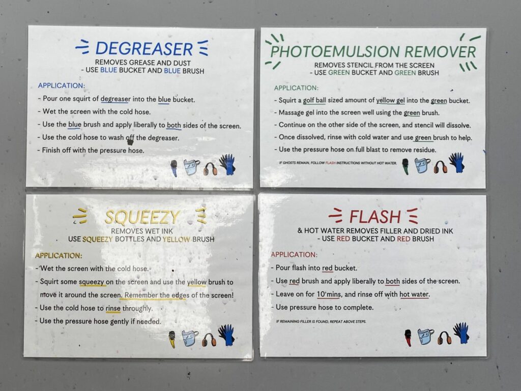
Then we went on to coat the screens with emulsion. The aim here was to create the thinnest coat of emulsion on the screen. Before starting with this section, you need to add a degreaser, squeezy, photo emulsion remover, and flash. Below is attached a photo that describes the process to ensure you start with a clean screen:

High-resolution bitmaps can be ruined by stains or marks, as it’ll leave a bright white section, which can be an eyesore.
One clean coating of emulsion is best for bitmaps.
When coating, you hold the trough to the screen and tilt it slightly down and wait until the emulsion rolls forward until it hits the screen. Then with even pressure and in one continuous motion, you coat it up the screen and tilt the trough at the top to catch the emulsion from dripping. Never touch the metal frame, and don’t push too hard, otherwise, you’ll break the mesh. Take a card and scrape the excess emulsion to reduce the drying time. Then place the coated screens in the drying rack as soon as possible.
By the end of day one, we had thoroughly covered the process of creating designs for screens, layering colours, and mixing ink. Additionally, we delved into the process of coating screens with emulsion and discussed considerations for printing with bitmaps. During breaks, I was able to experiment with creating unique shades of magenta, purple, and orange, with the intention of utilising them to craft a gradient while printing on the second day of the workshop.


Leave a comment