
Evaluation of Final Screen Prints
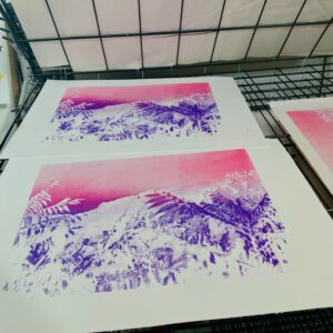
The final prints that I exhibited consisted of four screen prints, two monographs, and two blended prints.
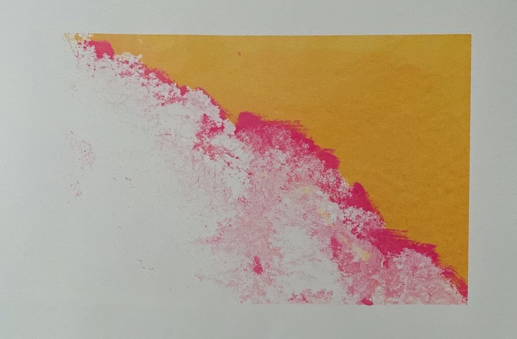
Upon first viewing, I found myself drawn to the orange and pink monograph for several reasons. Firstly, the piece highlighted my technical skill in screen printing—a printing technique that proved to be the most challenging technique I learned during the workshop. I invested a great deal of time and effort into perfecting this skill, and the monograph served as a testament to my growth and progress.
Moreover, the print featured a bold contrast between the detailed trees in the image and the sky, paralleling the juxtaposition of the bright orange and pink colours. This contrast was particularly striking, as it emphasised the intricate details of the trees while simultaneously drawing attention to the bold, vibrant colours.
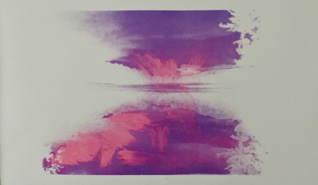
Unfortunately, I was too confident when attempting the second monograph and applied too much paint, clogging the mesh and causing too many misprints. The final monograph I chose was the best, but I’m still unhappy with the outcome. The pink brush strokes feel too faint and rushed, and there is a smear of pink on the bottom of the print that I tried to fix by cropping the image, but it’s still visible. If I had the time and money, I would have reprinted to achieve better quality.
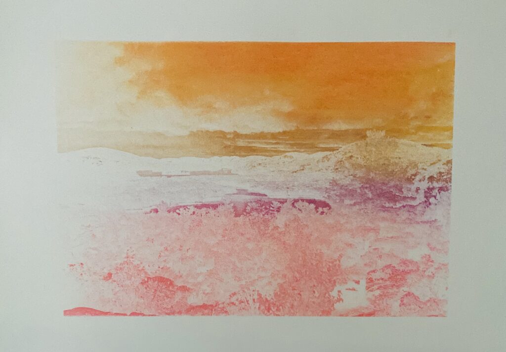
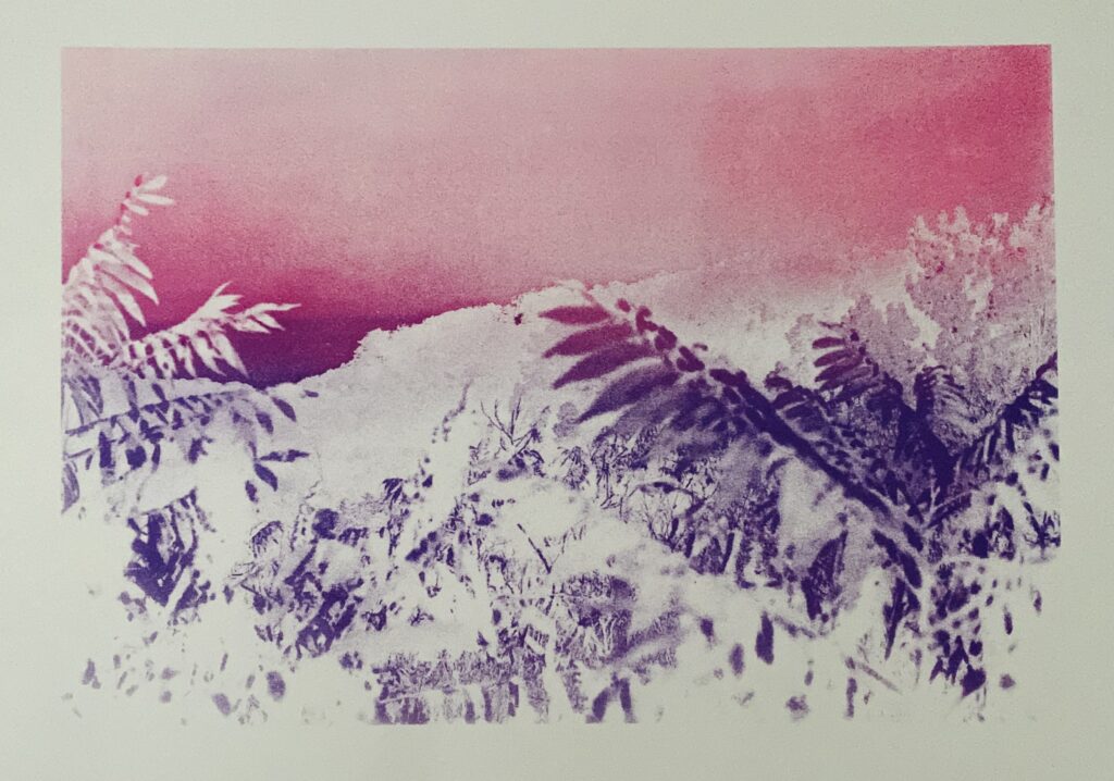
I’m satisfied with the outcome of the two blended screen prints. However, I believe there was a missed opportunity to add more dimension to the mountain landscape. I could have created an ominous atmosphere by using a darker colour like dark purple or grey; to show the details in the clouds to create a more visually appealing and intriguing print that communicated sombre undertones.



Leave a comment