
Elevating Your Photography: Unveiling the Magic of Dynamic Symmetry and the Rule of Thirds in Image Cropping
When cropping these images, I always consider two compositional rules: the rule of thirds and dynamic symmetry. At the end of this post, I will provide a YouTube video link that extensively discusses dynamic symmetry. The video utilizes Henri Cartier-Bresson’s work as examples to explain this compositional technique. You only need to know that it involves incorporating diagonal lines into the image to create movement and draw the viewer’s gaze.
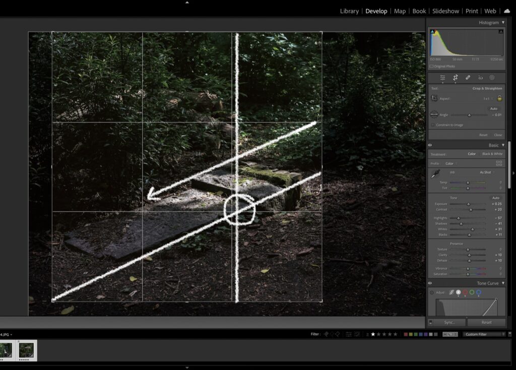
In Figure One, there is one line that follows the dynamic symmetry compositional lines, which is the lower white line. Additionally, there is a parallel line above it that comes from the light beam, drawing further attention to the fallen grave and the details of the moss and the effects of deterioration from the surrounding nature. The intersecting point at the lower right portion of the frame, which I’ve circled, is known to be the most visually intriguing point of an image.

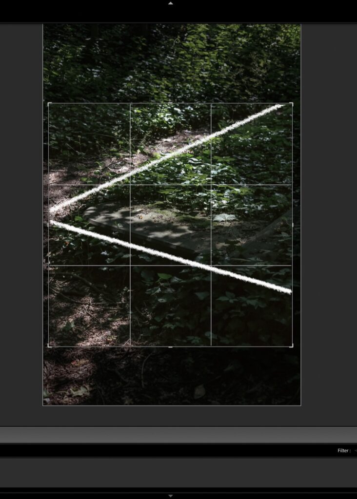
Similarly, in Figure 2, I have drawn where the leading lines are in the image and cropped accordingly. This way, I am intentional about where I want the viewer’s gaze to travel within the frame. In addition, by carefully selecting the composition of the image, I am able to convey a sense of mood and atmosphere. The way the surrounding foliage flourishes near these graves, becoming a symbol of Heidegger’s ecstases, is crucial to the overall meaning of the image. By including this context in the frame, the viewer is able to gain a deeper understanding of the significance of the graves and the surrounding area.
Furthermore, I experimented with different crop sizes in another image, trying to convey a sense of being swallowed by the grave. However, I found that the lack of context in the surrounding area didn’t allow the viewer to fully appreciate the significance of the graves. In order to provide a complete picture of the scene, I decided to include the surrounding foliage in the image. This provides a sense of depth and meaning to the composition that would be lost if the image was cropped too tightly. Therefore, by carefully considering the composition and context of the image, I am able to create a more engaging and meaningful visual experience for the viewer.
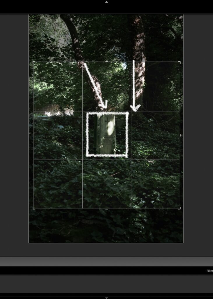
With regard to Figure three, my focus was not only on the leading lines, although they are still visible in my drawings. However, I also wanted to bring attention to the beautiful landscape surrounding the solitary grave at the centre of the frame. The way nature has taken over and thrived in this area is truly remarkable and speaks to the power of life. Moreover, I aimed to emphasise the significance of this memorial of the past, reminding viewers of the history and stories that lie beneath the surface of our everyday surroundings. By doing so, I hope to encourage a deeper appreciation and understanding of the world around us.
During the editing process of this image, I encountered a challenge that made it difficult to recover detailed information from the areas where the highlights were blown out. Unfortunately, despite my initial belief that I was shooting in RAW format, I later discovered that I had only shot in JPEG format, which made it harder to recover the lost details. This was a bigger issue than I had anticipated, as it limited my ability to adjust the highlights and shadows and create more depth between the subject and the background.
To compensate for this limitation, I had to be creative in how I approached the editing process. Specifically, I used Lightroom’s masking tool to slightly increase the exposure, highlights, whites, and clarity. By doing so, I was able to emphasise the most important aspects of the image and make a stronger impact on the viewer. While it was a challenging experience, it ultimately taught me the importance of being vigilant in my shooting habits and making sure that I am always using the right format for my images.
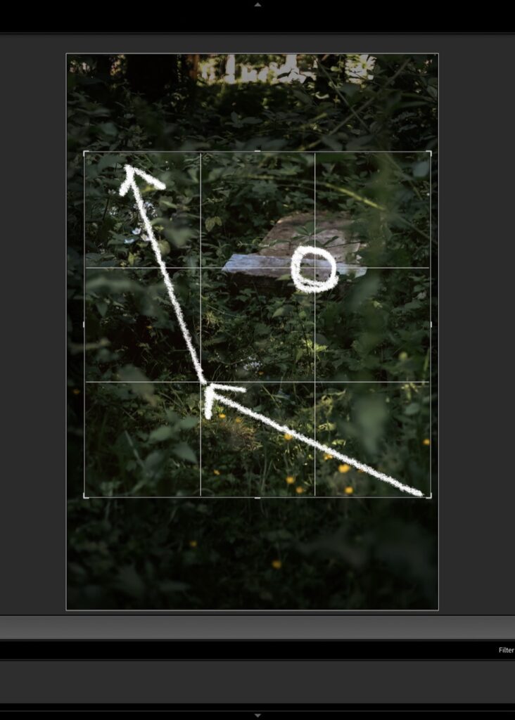
In order to create a more immersive atmosphere in these images, I decided to focus on the colours and how they contribute to the mood of the scene. I chose a desaturated look that mutes the greens and browns in the foliage, which draws the viewer’s attention to the details of the grave and its surroundings. To achieve this, I used the present H12 under the Cinematic tab in my editing software and then increased the vibrancy so that the colours still stand out against the grey of the tombstones. This technique is particularly evident in Figure Four, where the yellow flowers pop against the shrubbery surrounding the fallen grave. By playing with the colours in this way, I aimed to create a more nuanced and thought-provoking image that invites the viewer to explore the scene more deeply and consider its meaning.
In order to truly bring out the essence of the image, I decided to make some slight adjustments to the contrast and clarity. By doing so, I was able to enhance the texture and depth of the image, which in turn helped to emphasise the emotional impact of the image. My ultimate goal was to create a visually cohesive experience for the viewer through the use of colour grading.
Looking ahead, I plan on making further improvements to the colour scheme of the images. Specifically, I would like to introduce more blues into the images. However, before making any further changes, I plan on printing the images onto Polaroids. This will allow me to get a better sense of what adjustments I will need to make using Lightroom in order to achieve the desired effect. Overall, my aim is to create images that are not only visually stunning but also emotionally engaging for the viewer.
In conclusion, the process of editing these images was an exercise in creativity, problem-solving, and attention to detail. By carefully considering the composition, context, and colours of each image, I was able to create a more immersive and meaningful visual experience for the viewer. Additionally, the challenges I faced during the editing process taught me the importance of being vigilant in my shooting habits and ensuring that I am always using the right format for my images. Looking ahead, I am excited to continue exploring new editing techniques and pushing the boundaries of what is possible in visual storytelling.




Leave a comment